Layouts
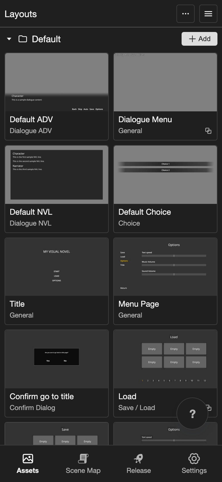
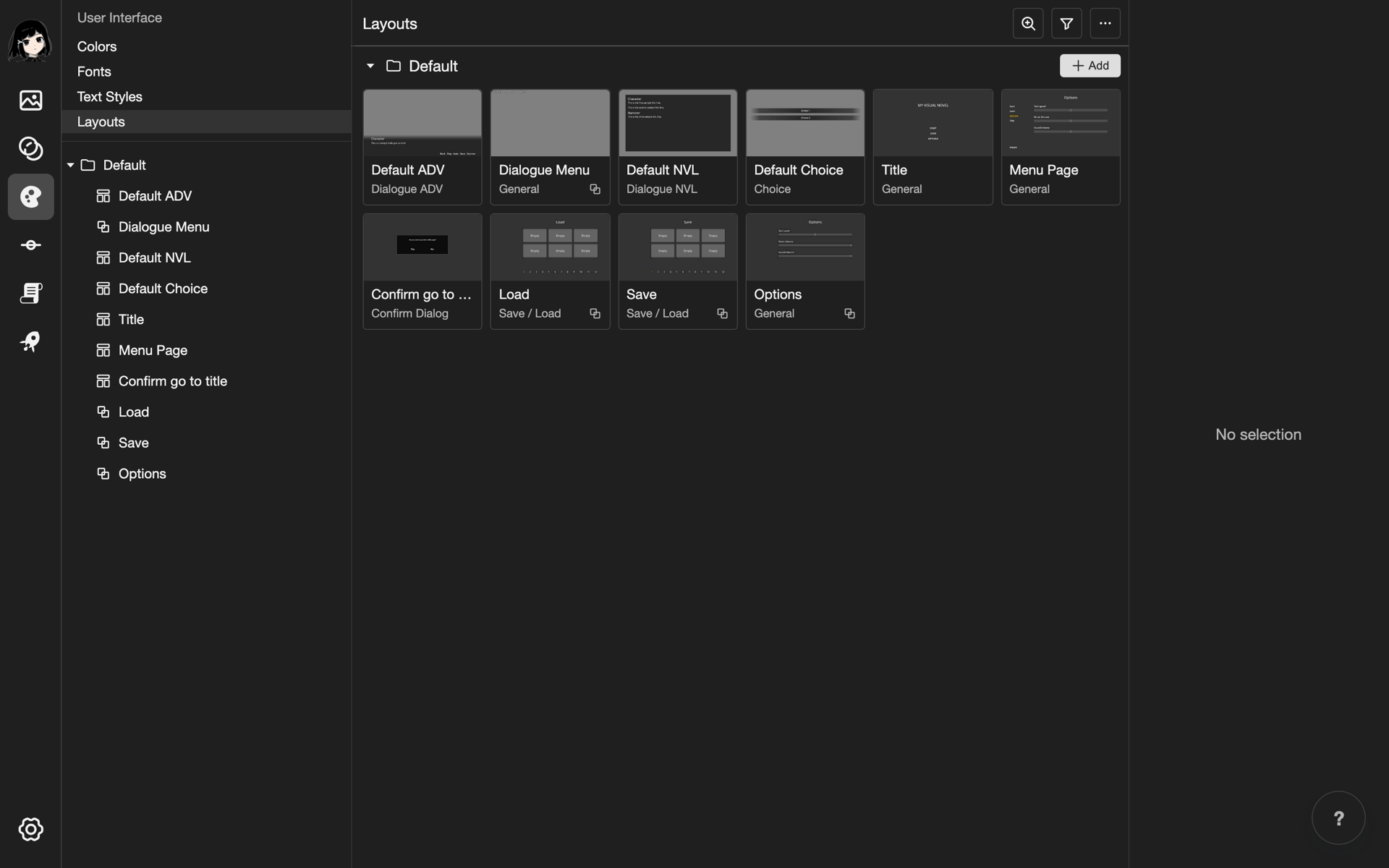
A layout is one part of the screen of your visual novel. For example, the dialogue box, the choice buttons, the title screen, or a menu. You build each layout from elements, such as images and text.
Words to know
- Layout: One screen, or one part of the screen.
- Element: One piece of a layout, such as an image or a text.
- Container: An element that holds other elements. When you move a container, everything in it moves too.
- Fragment: A layout that you can put inside other layouts.
Open the Layouts page
-
Open your project. See Projects.
-
Go to the Layouts page.
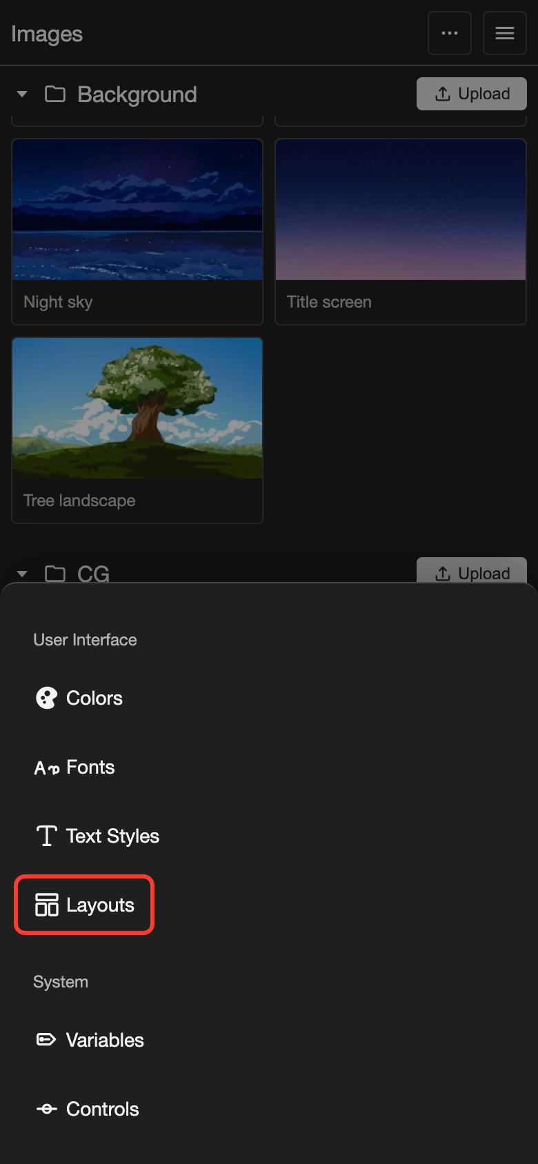
- Phone or tablet: Tap Assets in the bottom bar. Then tap Layouts under User Interface.
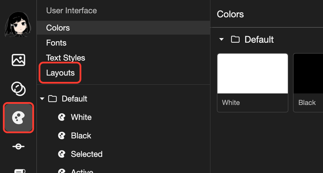
- Desktop: In the far left bar, click the User Interface button. It looks like a palette. Then click Layouts.
The Layouts page opens. It lists your layouts in folders.
Layout types
Each layout has a type. The type decides where you can use the layout, and its special elements. You choose the type when you create the layout. You cannot change it later.
| Layout type | What it is for |
|---|---|
| General | Any screen, such as a title screen or a menu |
| Dialogue ADV | A dialogue box that shows one line at a time |
| Dialogue NVL | Dialogue over the whole screen, where the lines add up |
| Choice | The options that the reader picks from |
| Save / Load | Save and load screens with save slots |
| Confirm Dialog | A small box with OK and Cancel |
| History | A list of the past dialogue lines |
| Input | A form where the reader types, such as a name |
Each line action lists only the layouts of its type:
- Dialogue Box: Dialogue ADV and Dialogue NVL
- Choices: Choice
- Input: Input
- Background and Visuals: General
Create a layout
-
Next to the Default folder, tap Add.
The Add Layout box opens.
-
In Layout Name, type a name. For example,
Name Entry. -
Under Layout Type, choose a type. For example, Input.
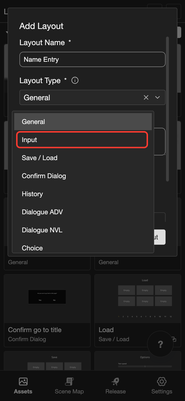
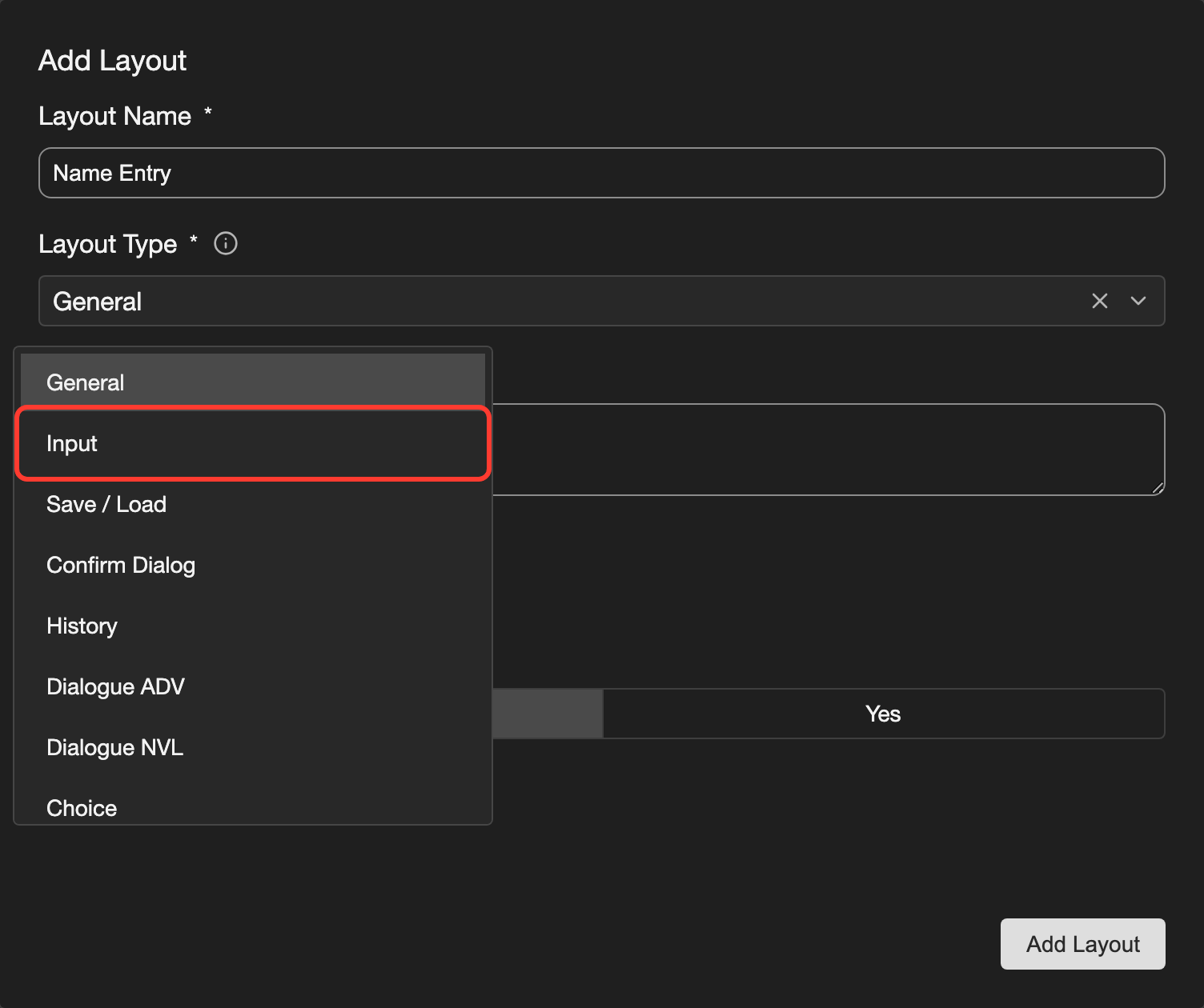
-
Tap Add Layout.
The new layout appears in the folder. Most types start empty. An Input layout starts with a box to type in and a button.
Description, Tags, and Can Be Used As Fragment are optional. See Tags and Fragment.
Open a layout
- Phone or tablet: Tap the layout. Then tap Open in the panel at the bottom.
- Desktop: Double-click (click twice quickly) the layout. Or click it once, then click Layout Editor in the details on the right.
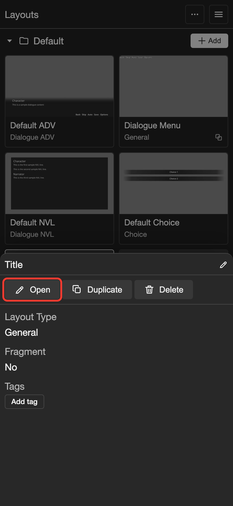
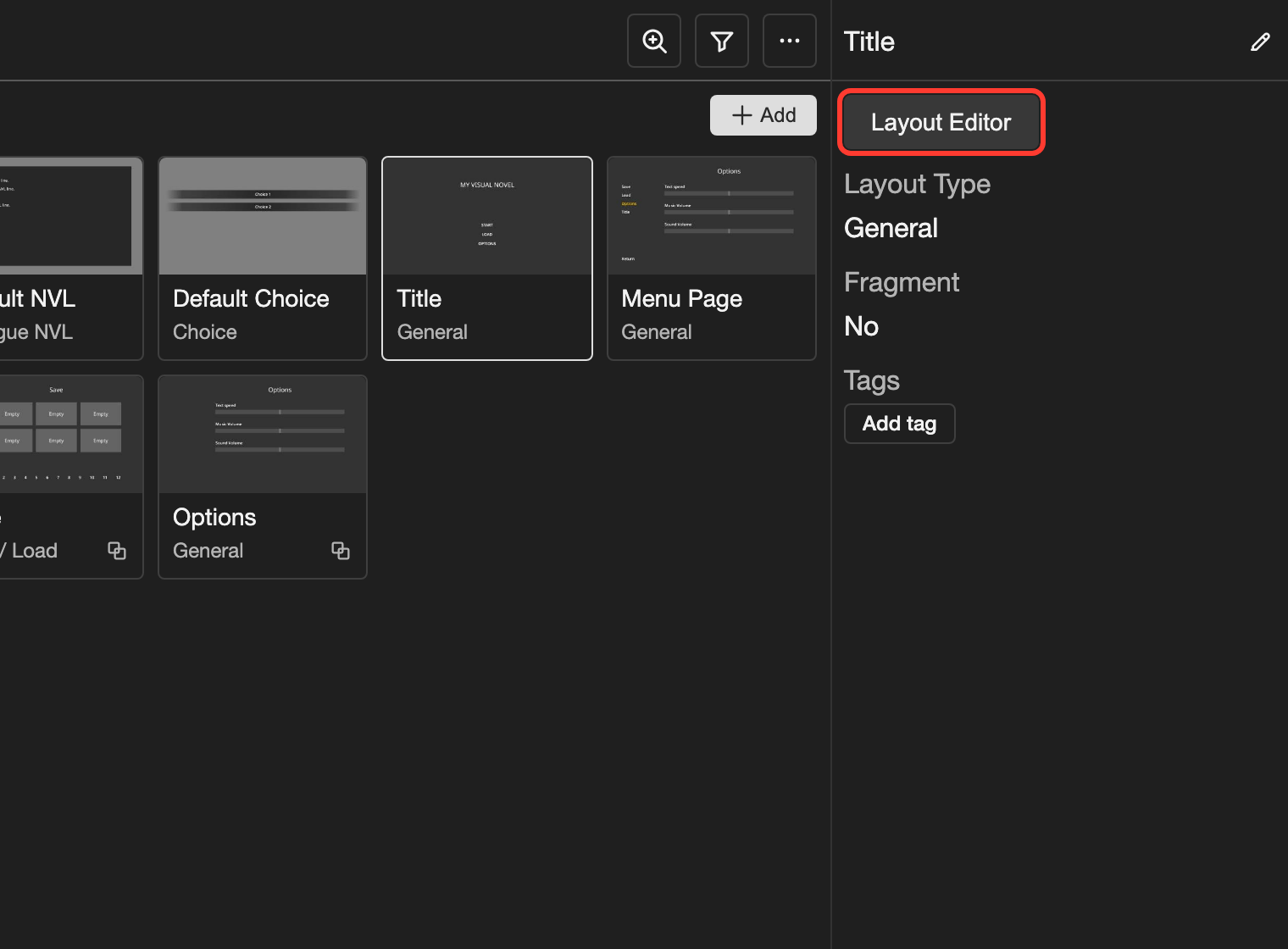
The layout editor opens.
Layout editor
In the layout editor, you add elements and arrange them. The examples on this page use a title screen layout called Title.
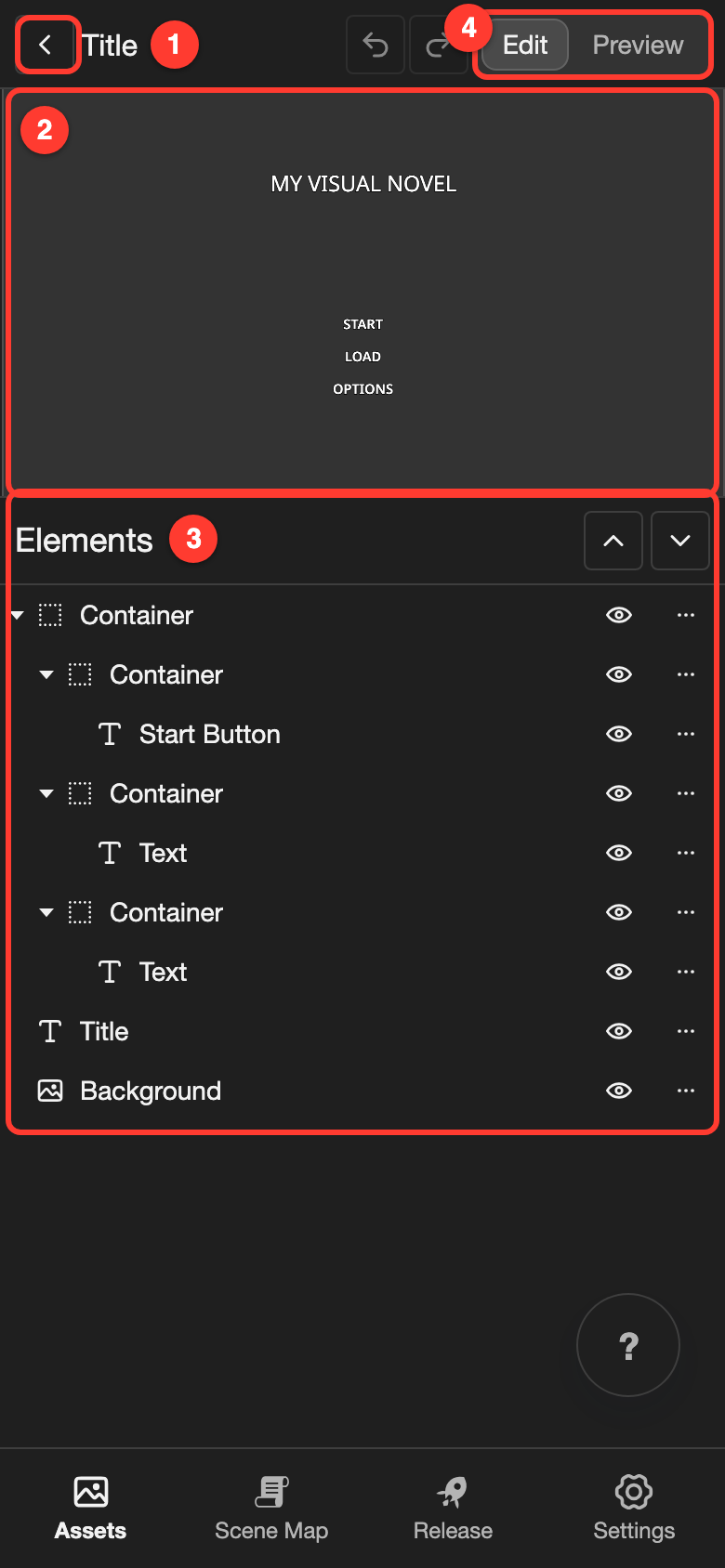
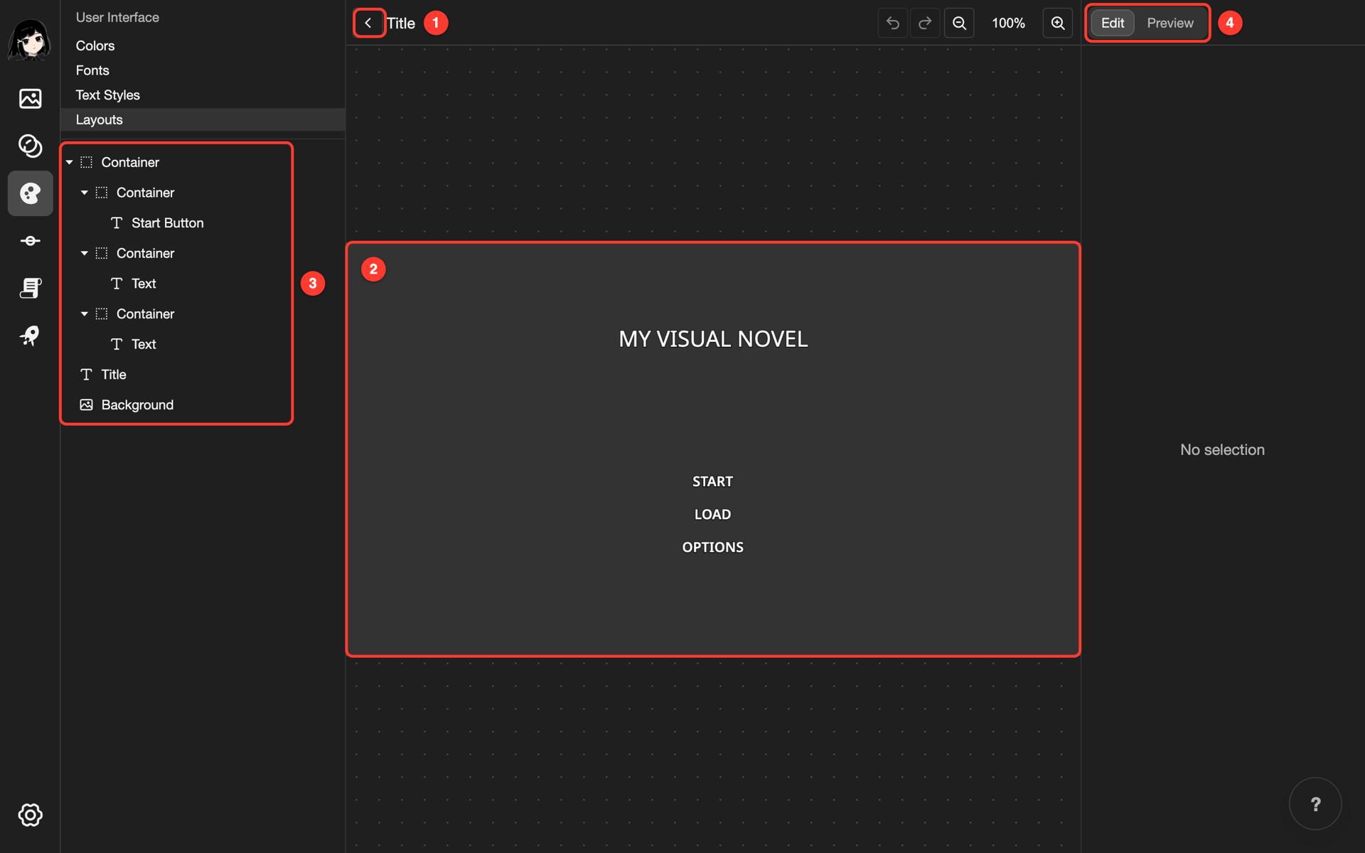
- Back button: Goes back to the Layouts page.
- Canvas: Shows the layout as the reader sees it.
- Elements: Lists every element in the layout. Elements higher in the list show in front of lower ones.
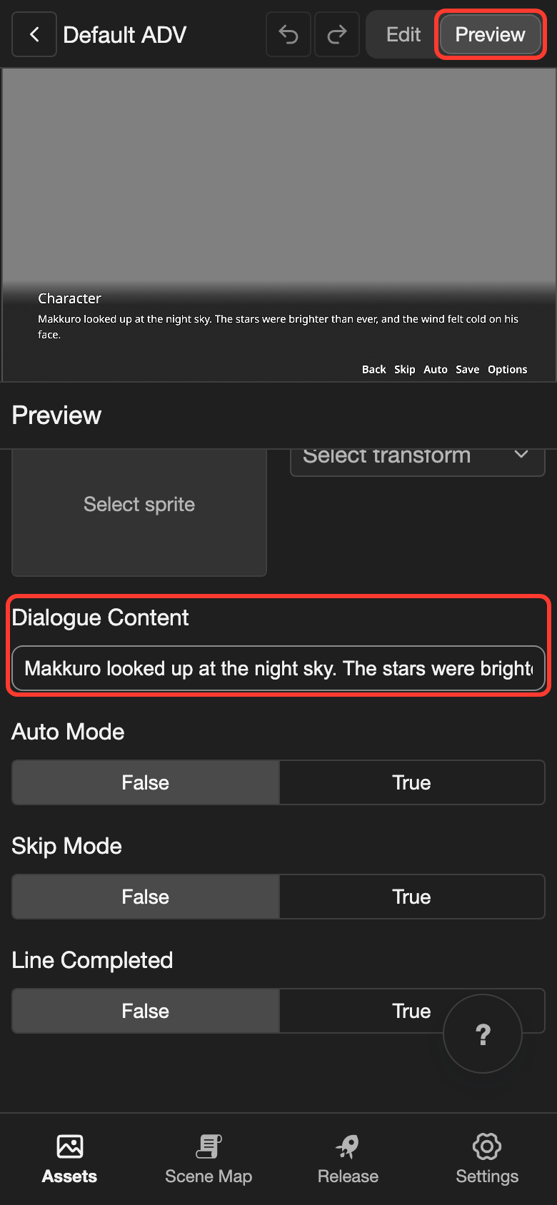
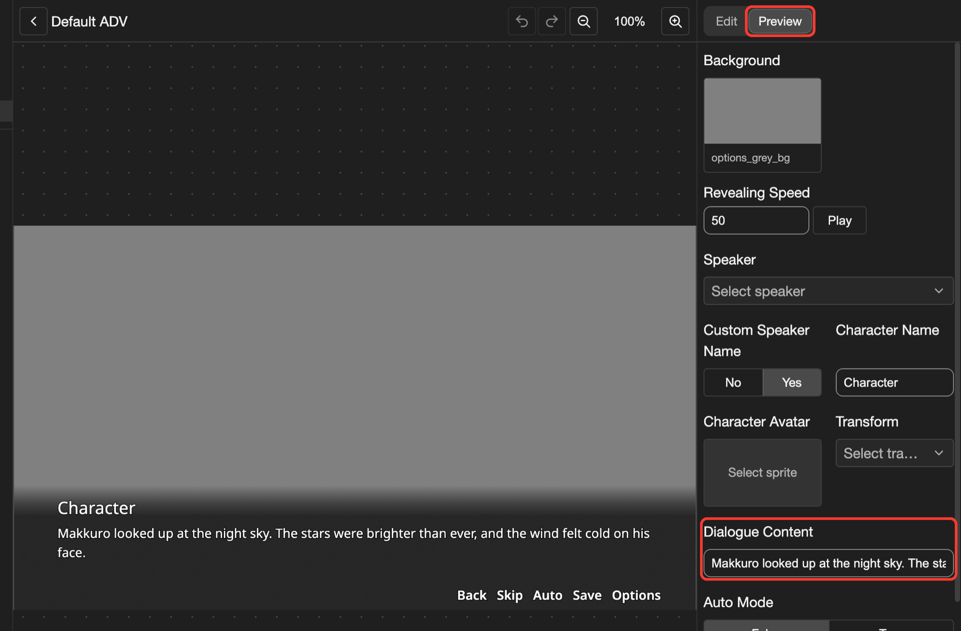
- Edit and Preview: Switch between building the layout and testing it with sample content.
To see the settings of an element, tap it in the Elements list.
- Phone or tablet: The settings show under the canvas, in place of the Elements list. To see the list again, tap the back button next to the element name.
- Desktop: The settings show on the right.
Add an element
-
Open the Add Element menu.
- Phone or tablet: Long press (touch and hold) the empty space under the Elements list. To add the element inside a container, tap the three dots button (the button with three dots that opens more options) next to the container instead.
- Desktop: Right-click (click with the right mouse button) the empty space under the Elements list. To add the element inside a container, right-click the container instead.
-
Tap the element type. For example, Text.
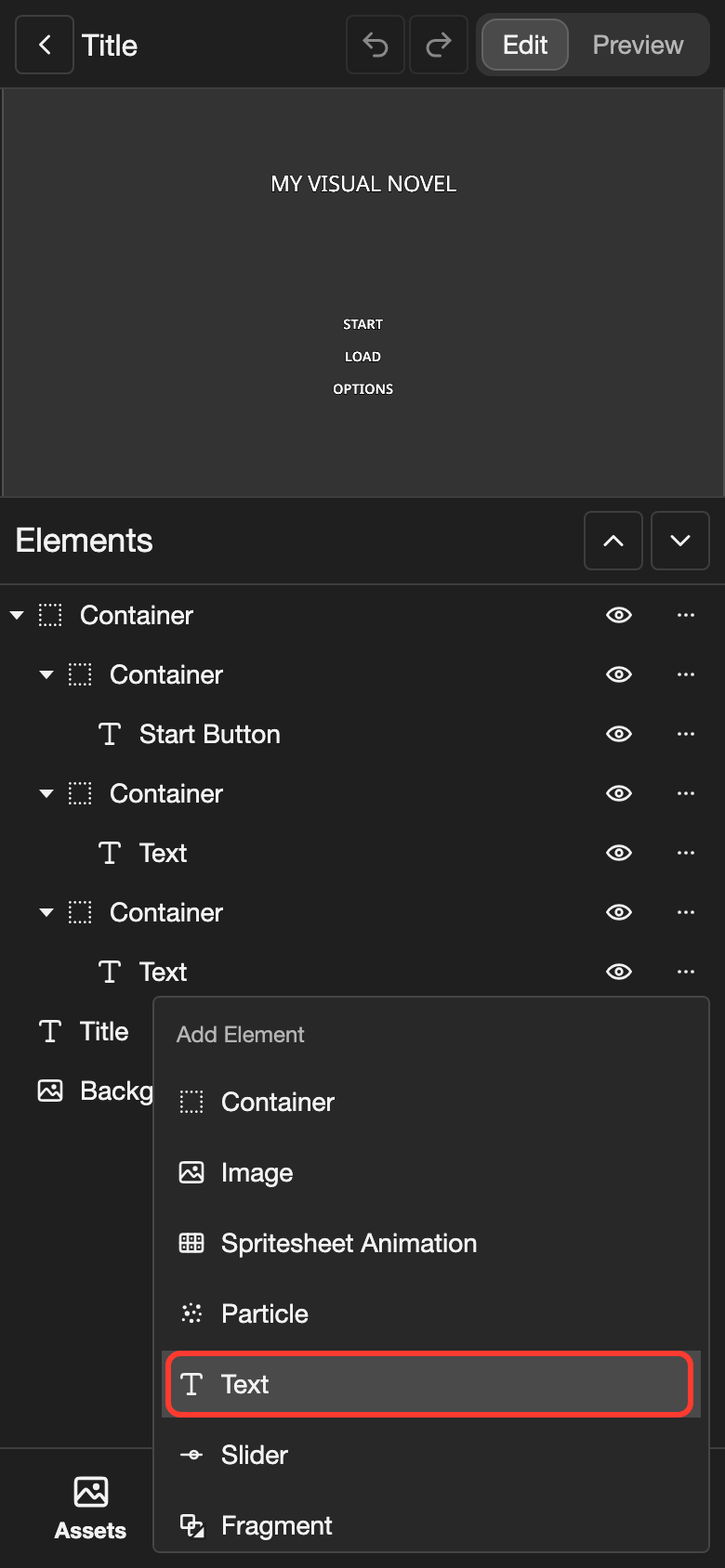
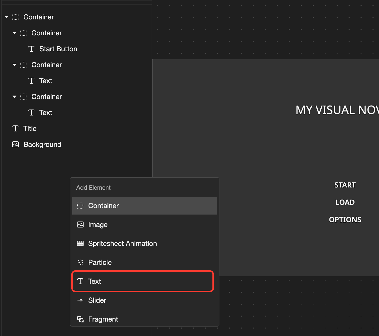
The new element appears first in the list, or first in its container. A new Text shows the word text in the top left corner of the canvas.
Image, Slider, Spritesheet Animation, Particle, Video, and Fragment open a box first. In the box, choose what the element shows. Then tap the button at the bottom, such as Create Image.
To rename or delete an element, open the same menu on the element. Then tap Rename or Delete.
Move and resize an element
-
In the Elements list, tap the element.
A white outline shows around the element on the canvas.
-
Move or resize the element on the canvas.
- To move it, drag (hold, then move without lifting your finger) the element.
- To resize it, drag an edge of the outline.
You can also type the numbers under Transform.
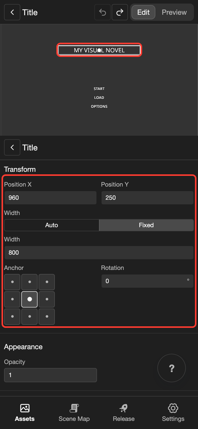
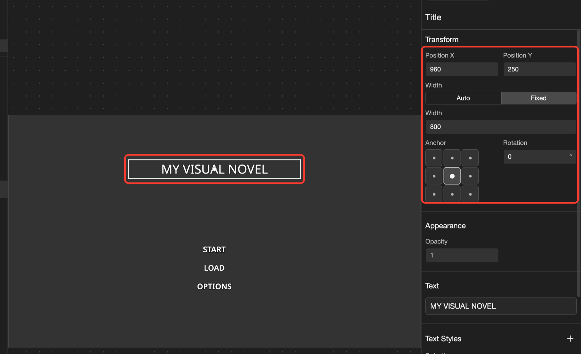
- Position X and Position Y: Where the element is, in pixels from the top left corner. Inside a container, they count from the container.
- Width and Height: The size of the element, in pixels. The screen is 1920 x 1080 pixels. See Resolution.
- Anchor: The point of the element that sits at the position. For example, the Title text uses the center point.
On desktop, the arrow keys also move the selected element by 1 pixel.
To line up elements in a row or a column, put them in a container. In the container's settings, find Direction. Choose the middle button for a row, or the right button for a column. The elements in it then line up on their own. To change their order, drag them in the Elements list.
Change an element's settings
Each type of element has its own settings. These are the most common:
| Setting | What it does |
|---|---|
| Transform | The position, size, anchor, and rotation of the element |
| Opacity | How see-through the element is, from 0 (invisible) to 1 (solid) |
| Text | The words of a text element. Tap them to open the Text box. Type / to add a variable. |
| Text Styles | The look of the text. See Text Styles. |
| Image | The picture of an image element. You can add a Hover and a Click picture. |
| Sound | A sound that plays when the reader points at the element or taps it |
| Visibility | Shows the element only at some times, such as when a variable is true |
| Actions | What happens when the reader taps, right-clicks, or scrolls on the element |
| Conditional | Changes the text style or the picture when a condition is true |
Some settings, such as Visibility and Actions, start empty. To add one, tap the + button next to its name.
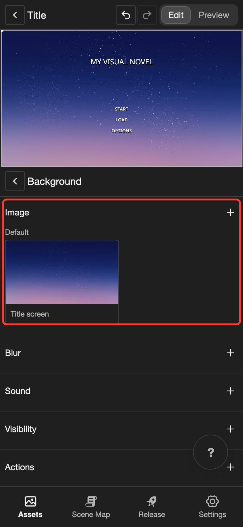
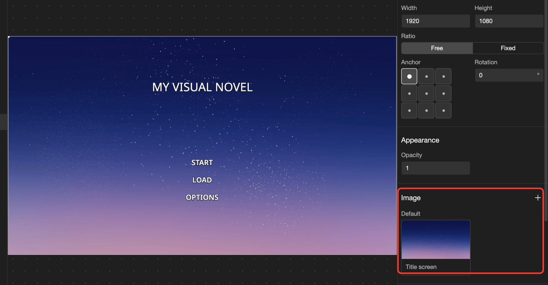
For example, give the title screen a new background:
-
In the Elements list, tap Background.
-
Scroll down to Image. Then tap the picture under Default.
A box with your images opens.
-
Tap Title screen. Then tap Select.
The canvas shows the new background.
Element types
| Element | What it shows |
|---|---|
| Container | Nothing by itself. It holds other elements and can line them up. |
| Image | A picture from your Images page |
| Text | Words, in a text style. A text style uses a font and a color. |
| Slider | A bar with a handle that the reader drags, such as a volume bar |
| Spritesheet Animation | An animation from your Spritesheets page |
| Particle | A particle effect from your Particles page, such as falling snow |
| Video | A video from your Videos page, such as a moving background |
| Fragment | Another layout, made to be shared by many layouts |
Save and preview
RouteVN Creator saves each change right away. To undo a change, tap the undo button, the arrow that turns left.
To test a layout with sample content, tap Preview at the top. For example, in a Dialogue ADV layout, type a long sentence in Dialogue Content. Check that it fits in the dialogue box. The sample content does not change your visual novel.
To see a layout in your visual novel, use it in a line action. See Layout types.
Special elements
Most layout types have their own elements. Your visual novel fills them in while it runs, such as the words of a line or the date of a save. Each layout type page explains them, with an example. To find a page, see Layout types.
Fragments
A fragment is a layout that you put inside other layouts. Use it for parts that many layouts share. When you change the fragment, every layout that uses it changes too.
For example, a fragment can hold the Back, Skip, Auto, Save, and Options buttons. Then all your dialogue layouts can use the same buttons.
To make a fragment and put it in a layout, see Fragment.
Good to know
- On the canvas, a tap on an element in a container selects the container. To select the element itself, tap it in the Elements list.
- To hide an element, tap the eye button (the button that looks like an eye) next to it in the Elements list. A hidden element is also hidden in your visual novel.
- You cannot delete a layout that is in use.
- You cannot delete the last Dialogue ADV, Dialogue NVL, or Choice layout.
- The Controls page uses the same editor.